dropDown
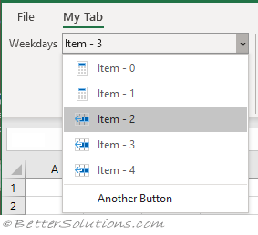
This control allows the user to select from a list of possible choices.
 |
The value returned is the list index.
In the object model this is RibbonDropDown
A dropdown control can contain items or even buttons after its selection items.
This control is similar to a gallery control but the gallery control also allows items to be arranged in a grid.
You cannot manipulate the buttons collections at runtime but you can show and hide existing buttons to create the equivalent of a dynamic list.
RibbonDropDown has an Items collection that contains RibbonDropDownItem controls.
This collection can be modified at runtime.
link - learn.microsoft.com/en-us/openspecs/office_standards/ms-customui/700e4451-8706-40c5-8d7b-896e4ae21b69
<customUI xmlns="http://schemas.microsoft.com/office/2009/07/customui">
    <ribbon startFromScratch="false">
        <tabs>
            <tab id="CustomTab" label="My Tab">
                <group id="Group1" label="MyGroup">
                    <dropDown id="MyDropDown"
                              sizeString="AAAAAAAAAAAAAAAAAAAAAAA"
                              onAction="DropDown_OnAction"
                              getEnabled="DropDown_OnGetEnabled"
                              getLabel="DropDown_OnGetLabel"
                              getSelectedItemIndex="DropDown_OnGetSelectedItemIndex"
                              getShowLabel="DropDown_OnGetShowLabel"
                              getVisible="DropDown_OnGetVisible">
                        <item id="One" label="Mon"/>
                        <item id="Two" label="Tue"/>
                        <item id="Three" label="Wed"/>
                        <button id="button" label="Another Button" onAction="Button_OnAction" />
                    </dropDown>
                </group>
            </tab>
        </tabs>
    </ribbon>
</customUI>
Attributes (properties)
| enabled | (Enabled) "true" | "false" |
| id | (Id) |
| idMso | |
| idQ | |
| image | (Image) |
| imageMso | (OfficeImageId) |
| insertAfterMso | |
| insertAfterQ | |
| insertBeforeMso | |
| insertBeforeQ | |
| keytip | (KeyTip) |
| label | (Label) |
| screentip | (ScreenTip) |
| showImage | "true" | "false" |
| showItemLabel | "true" | "false" |
| showItemImage | "true" | "false" |
| showLabel | "true" | "false" |
| size | (ItemImageSize) size of the images displayed |
| sizestring | (SizeString) "xxxxxxxx" ?? |
| supertip | (SuperTip) |
| tag | (Tag) |
| visible | (Visible) "true" | "false" |
| (GenerateMember) | |
| (Buttons) add buttons to the list, can only be done at design-time | |
| (Items) add items to the list can also be done at run-time | |
| (Modifiers) |
Children
This control can contain the following controls
| Button | |
| Item |
C# Events (design-time)
These events can be accessed if you use the Visual Studio Ribbon Designer.
| ButtonClick | |
| ItemsLoading | The ItemsLoading event is raised before the dropdown is displayed |
| SelectionChanged | OnAction attribute - This is the design-time equivalent of the run-time OnAction callback event |
' C#
void DropDown_ButtonClick(object sender,
                          RibbonControlEventArgs e)
{
}

void DropDown_ItemsLoading
{
}

void DropDown_SelectionChanged(
{
}
Callbacks (run-time)
| onAction | DropDown_OnAction - Fired when you choose an item in the drop-down. This is the run-time equivalent to the design-time SelectedChanged event |
| getEnabled | DropDown_OnGetEnabled - Whether the drop-down is enabled or not. |
| getImage | DropDown_OnGetImage - Gets the image associated with the drop-down. |
| getItemCount | DropDown_OnGetItemCount - Gets the total number of items to display in the drop-down. |
| getItemID | DropDown_OnGetItemID - Gets the ID for a particular item. (The "Generate Callbacks" inside the Custom UI Editor does not generate this) |
| getItemImage | DropDown_OnGetItemImage - Gets the image for a particular item. |
| getItemLabel | DropDown_OnGetItemLabel - Gets the label for a particular item. |
| getItemScreentip | DropDown_OnGetItemScreentip - Gets the screentip for a particular item. (The "Generate Callbacks" inside the Custom UI Editor does not generate this) |
| getItemSupertip | DropDown_OnGetItemSupertip - Gets the supertip for a particular item. (The "Generate Callbacks" inside the Custom UI Editor does not generate this) |
| getKeytip | DropDown_OnGetKeytip - Gets the keytip to display with the drop-down. |
| getLabel | DropDown_OnGetLabel - Gets the label to display next to the drop-down. This callback cannot be placed in the ThisWorkbook code module, it must be placed in a regular Code Module. This cannot be used if you have hard coded a Label attribute because getLabel and Label are mutually exclusive. |
| getScreentip | DropDown_OnGetScreentip - Returns the screentip to display with the drop-down. |
| getSelectedItemID | DropDown_OnGetSelectedItemId - Returns the ID of the item that you want selected by default. This is mutually exclusive with the getSelectedItemIndex callback. |
| getSelectedItemIndex | DropDown_OnGetSelectedItemIndex - Returns the Index of the item that you want selected by default. This is mutually exclusive with the getSelectedItemId callback. |
| getShowImage | DropDown_OnGetShowImage - Whether the image is displayed next to the drop-down. |
| getShowLabel | DropDown_OnGetShowLabel - Whether the label is displayed next to the drop-down. |
| getSupertip | DropDown_OnGetSupertip - Gets the supertip to display with the drop-down. |
| getVisible | DropDown_OnGetVisible - Whether the drop-down is visible or not. |
' VBA
Public Sub DropDown_OnAction( _
   ByRef control As Office.IRibbonControl, _
   ByRef dropdownID As String, _
   ByRef selectedIndex As Variant)

   Call MsgBox("OnAction" & selectedIndex)
End Sub

' C# Equivalent
void DropDown_OnAction(
   Office.IRibbonControl control,
   string dropdownID,
   int selectedIndex)
{
}
' VBA
Public Sub DropDown_OnGetEnabled( _
   ByRef control As Office.IRibbonControl, _
   ByRef Enabled As Variant)

   Enabled = True
End Sub

' C# Equivalent
bool DropDown_OnGetEnabled(
   Office.IRibbonControl control)
{
}
' VBA
Public Sub DropDown_OnGetImage( _
   ByRef control As Office.IRibbonControl, _
   ByRef Image As Variant)

End Sub

' C# Equivalent
System.Drawing.Bitmap DropDown_OnGetImage(
   Office.IRibbonControl control)
{
   return new System.Drawing.Bitmap(Properties.Resources.untitled);
}
' VBA
Public Sub DropDown_OnGetItemCount( _
   ByRef control As Office.IRibbonControl, _
   ByRef Count As Variant)

   Count = 5
End Sub

' C# Equivalent
int DropDown_OnGetItemCount(
   Office.IRibbonControl control)
{
}
' VBA
Public Sub DropDown_OnGetItemID( _
   ByRef control As Office.IRibbonControl, _
   ByRef Index As Integer, _
   ByRef ItemID As Variant)

   ItemID = "ID" & Index
End Sub

' C# Equivalent
string DropDown_OnGetItemID(
   Office.IRibbonControl control,
   int Index)
{
}
' VBA
Public Sub DropDown_OnGetItemImage( _
   ByRef control As Office.IRibbonControl, _
   ByRef Index As Integer, _
   ByRef Image As Variant)

   Set Image = LoadPicture(ThisWorkbook.Path & "image_" & index + 1 & ".jpg")
   Set Image = Application.Commandbars.GetImageMso("",16,16)
End Sub

' C# Equivalent
string DropDown_OnGetItemImage(
   Office.IRibbonControl control,
   int Index)
{
}
' VBA
Public Sub DropDown_OnGetItemLabel( _
   ByRef control As Office.IRibbonControl, _
   ByRef Index As Integer, _
   ByRef ItemLabel As Variant)

   ItemLabel = "Item - " & Index
End Sub

' C# Equivalent
string DropDown_OnGetItemLabel(
   Office.IRibbonControl control,
   int Index)
{
}
' Generate Callbacks does not generate this
Public Sub DropDown_OnGetItemScreentip( _
' Generate Callbacks does not generate this
Public Sub DropDown_OnGetItemSupertip( _
' VBA
Public Sub DropDown_OnGetKeytip( _
   ByRef control As Office.IRibbonControl, _
   ByRef Keytip As Variant)

End Sub

' C# Equivalent
string DropDown_OnGetKeytip(
   Office.IRibbonControl control)
{
}
' VBA
Public Sub DropDown_OnGetLabel( _
   ByRef control As Office.IRibbonControl, _
   ByRef Label As Variant)

   Label = "My Label Text"
End Sub

' C# Equivalent
string DropDown_OnGetLabel(
   Office.IRibbonControl control)
{
}
' VBA
Public Sub DropDown_OnGetScreentip( _
   ByRef control As Office.IRibbonControl, _
   ByRef Screentip As Variant)

End Sub

' C# Equivalent
string DropDown_OnGetScreentip(
   Office.IRibbonControl control)
{
}
' VBA
Public Sub DropDown_OnGetSelectedItemID( _
   ByRef control As Office.IRibbonControl, _
   ByRef SelectedItem As Variant)

End Sub

' C# Equivalent
string DropDown_OnGetSelectedItemId(
   Office.IRibbonControl control)
{
}
' VBA
Public Sub DropDown_OnGetSelectedItemIndex( _
   ByRef control As IRibbonControl, _
   ByRef returnedVal As Variant)

   returnedVal = 1
End Sub

' C# Equivalent
int DropDown_OnGetSelectedItemIndex(
   Office.IRibbonControl control)
{
}
' VBA
Public Sub DropDown_OnGetShowImage( _
   ByRef control As Office.IRibbonControl, _
   ByRef ShowImage As Variant)

End Sub

' C# Equivalent
string DropDown_OnGetShowImage(
   Office.IRibbonControl control)
{
}
' VBA
Public Sub DropDown_OnGetShowLabel( _
   ByRef control As Office.IRibbonControl, _
   ByRef ShowLabel As Variant)

   ShowLabel = True
End Sub

' C# Equivalent
string DropDown_OnGetShowLabel(
   Office.IRibbonControl control)
{
}
' VBA
Public Sub DropDown_OnGetSupertip( _
   ByRef control As Office.IRibbonControl, _
   ByRef Supertip As Variant)

End Sub

' C# Equivalent
string DropDown_OnGetSupertip(
   Office.IRibbonControl control)
{
}
' VBA
Public Sub DropDown_OnGetVisible( _
   ByRef control As Office.IRibbonControl, _
   ByRef Visible As Variant)

   Visible = True
End Sub

' C# Equivalent
string DropDown_OnGetVisible(
   Office.IRibbonControl control)
{
}
© 2026 Better Solutions Limited. All Rights Reserved. © 2026 Better Solutions Limited TopPrevNext