Images
The majority of the controls can have an image associated with them.
The choice of image and display style is controlled by the following attributes:
| image | Used when you want to provide a custom image |
| imageMso | Used when you want to use one of the built-in icons |
| getImage | Used when you want to change a custom controls image while you application is running. |
| getItemImage | |
| getShowImage | |
| getShowItemImage | |
| showImage | Controls whether an image is displayed or not |
| showItemImage | Controls whether an image is displayed for a dropDown, comboBox or gallery item. |
| size | normal takes up 1 row large takes up 3 rows. |
| getSize |
Custom UI Editor - Built-in Images
These are static as it happens at design-time.
There are several different ways an image can be loaded dynamically:
You can use ImageMso to assign a built-in icon to your controls
<button id="Button1"
        imageMso="HappyFace"
        size="large"
        label="Large Button"
        onAction="ThisWorkbook.MyMacro"/>
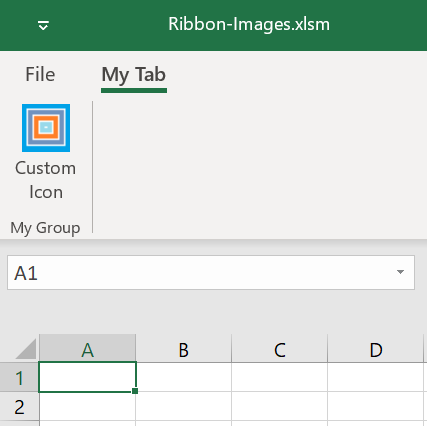
Custom UI Editor - Custom Images
Images that are full-color (24 bit) that also have an alpha channel to control the transparency that are saved in .png format (Portable Network Graphic) work best.
 |
NodePad - Custom Images
XML File Changes
In the file the images are saved in the following folder: CustomUI\images
and also creates a customUI.xml.rels file in the customUI\_rels folder to relate the Ids to the actual image files.
Dynamically - getImage Callback
A number of controls provide a getImage callback
Dynamically - loadImage Callback
This is dynamic as it happens at run-time
© 2026 Better Solutions Limited. All Rights Reserved. © 2026 Better Solutions Limited TopPrevNext