Chart Styles
Set a style and colour scheme
Incorporates the chart styles group from the Design tab
Formatting your charts will improve their appearance.
There are a couple of ways to apply formatting to your charts:
1) Using the (Home tab) - font changes
2) Using Format Selection dialog box
3) Using Chart Styles (Design tab)
4) Using Shape Styles (Format tab)
5) Using WordArt Styles (Format tab)
6) Using a Template (Design tab)
Chart Styles
SS - gallery
Changing the chart style does not change the theme colours
The gallery of chart styles corresponds and has a direct link to the theme colours
If you format a chart using one one of the chart styles it will become linked to the theme attached to the workbook
All of the different chart items can be formatted separately and the main components are summarised below:
Alignment (for text), Style (for lines), Weight (for lines) Borders (for areas), Patterns (for areas) Number Formats (for axes).
A lot of the tabs and dialog boxes for formatting charts are the same as those used for other formatting tasks.
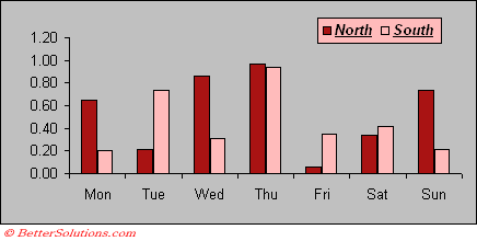 |
You can distinguish different series on the same chart by changing their colour, borders, patterns and data markers (line charts). ??
Colour Palette
Automatic colours come across as "automatic" although the colour is not technically validated
Home Tab
You can select a series and use the Fill Color drop-down to change the fill colours
All the formatting toolbars and commands can also be used to help format your charts
 |
Fill Color - Changes the background colour of the chart item.
Font Color - Changes the colour of the font of the current selection.
Bold - Toggles bold on the current selection.
Underline - Toggles underline on the current selection.
Italics - Toggles italics on the current selection.
Formatting Elements
You can select individual elements and change their formatting.
To change the colour of individual data points you can display the Format Data Point dialog box. Select the Fill tab and select solid Fill
SS
Click on the Color drop-down and choose your specific colour.
SS
It is important to emphasis that most of the colours displayed are linked to the theme attached to the workbook
If you would like the colour to be completely fixed (independent of the theme) and never change then you need to click on More Colors at the bottom.
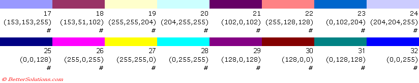
Default Colour Palette
These are the colours that are used for the fill and line colours on the default colour palette.
 |
Font Formatting
The font options that are available when formatting charts are slightly different to those when formatting your worksheet.
SS
Latin Text Font -
Font Style -
Size -
Asian Text Font -
Font Color -
Underline Style -
Underline Color -
Strikethrough -
Double Strikethrough -
Superscript -
Subscript -
Offset -
Small Caps -
All Caps -
Equalize Character Height -
Important
You can quickly change the colour of a series on a chart by using the Fill Color on the Formatting toolbar.
You can double click on an item to quickly display the corresponding Format dialog box or you can use the shortcut key (Ctrl + 1).
It is possible to enhance your charts with pictures, word art, clip art, text, lines, arrows etc.
You cannot have any colours on your charts that are not on the colour palette
Double clicking anywhere on a chart takes you directly to the Format dialog box for that particular item
© 2026 Better Solutions Limited. All Rights Reserved. © 2026 Better Solutions Limited TopPrevNext