CheckBox (chb)
 | CheckBox - This control allows the user to either select or deselect an option. |
To return a checkbox or option box selection in lower case use Format(chkSelectedOnly.Value,"<").
When the checkbox is checked it has a value of True and when it is not checked it has a value of False.
Very useful when you want to give the user a choice of yes or no. On or off.
Properties
| Accelerator | Sets or retrieves the accelerator key. |
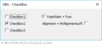
| Alignment | Specifies the position of the checkbox relative to its caption. (either frmAlignmentRight or frmAlignmentLeft) |
| AutoSize | Specifies whether an object automatically resizes to display its entire contents. (true or false) |
| BackColor | Specifies the background color. |
| BackStyle | Sets or retrieves the background style. (either fmBackStyleTransparent or fmBackStyleOpaque) |
| Caption | The text that appears next to the checkbox. |
| ControlTipText | Specifies text that appears when the user briefly holds the mouse pointer over a control without clicking. |
| Enabled | Specifies whether the control can receive the focus and respond to user-generated events. (true or false) |
| Font | Specifies the font used to display the caption text. Tahoma, regular, 8 (default) |
| ForeColor | Specifies the foreground color. |
| GroupName | Creates a group of mutually exclusive OptionButton controls. |
| Height | 18 is the default but 15 is sufficient. |
| Locked | Specifies whether the control can be edited. |
| MouseIcon | Assign a custom icon that appears when the user moves the mouse over this control. The MousePointer property must be set to fmMousePointerCustom.
|
| MousePointer | Specifies the type of pointer displayed when the user positions the mouse over a particular object. fmMousePointerDefault is the default.
|
| Picture | Specifies a picture that is displayed instead of the text caption. |
| PicturePosition | Specifies the location of the picture relative to the text caption.
fmPicturePositionAboveCenter is the default
|
| SpecialEffect | Specifies the visual appearance of an object. (either fmButtonEffectSunken or fmButtonEffectFlat) |
| TabIndex | The index number in the tab order |
| TabStop | Indicates whether the control can receive focus when the user tabs to it. (true or false). The default is True
|
| TextAlign | Specifies how the text is aligned. (fmTextAlignLeft, fmTextAlignCenter or fmTextAlignRight) |
| TripleState | Determines whether the control can accept the Null state. The default is false
|
| Value | Specifies the status or content of the control |
| Width | The width, in points. |
| WordWrap | Indicates whether the text caption will automatically wrap at the end of the line. |
Methods
| Move | Moves a form or control, or moves all the controls in the Controls collection. |
| SetFocus | Moves the focus to this instance of an object. |
| ZOrder | Places the object at the front or back of the z-order. |
Events
| AfterUpdate | Occurs after data in a control is changed through the user interface. |
| BeforeUpdate | Occurs before data in a control is changed. |
| BeforeDragOver | Occurs when a drag-and-drop operation is in progress. |
| BeforeDropOrPaste | Occurs when the user is about to drop or paste data onto an object. |
| Change | Occurs when the Value property changes. |
| Click | Occurs when the user clicks on the control |
| DblClick | Occurs when the user points to an object and then clicks a mouse button twice. |
| Enter | Occurs before a control actually receives the focus from a control on the same form. |
| Exit | Occurs immediately before a control loses the focus to another control on the same form. |
| Error | Occurs when a control detects an error and cannot return the error information to a calling program. |
| KeyDown | Occurs in sequence when a user presses a key. |
| KeyPress | Occurs when the user presses an ANSI key. |
| KeyUp | Occurs in sequence when a user releases a key. |
| MouseDown | Occur when the user presses the mouse button. |
| MouseMove | Occurs when the user moves the mouse. |
| MouseUp | Occur when the user releases the mouse button. |
© 2026 Better Solutions Limited. All Rights Reserved. © 2026 Better Solutions Limited TopPrevNext