CommandButton (btn)
 | CommandButton - This control allows the user to perform a specific action and will run a separate subroutine. |
 |
Default BackColor = System > Button Face
Default ForeColor = System > Button Text
Default Font - Tahoma, 8, regular
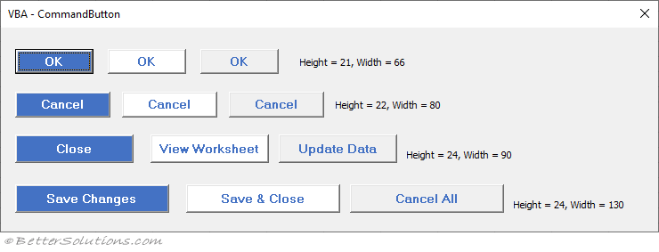
You should always have the Cancel button on the right hand side of your dialog boxes
Arrows
Use Wingding3
Left Arrow - (t) - Alt + 116
Right Arrow - (u) - Alt + 117
Up Arrow - (p) - Alt + 112
Down Arrow (q) - Alt + 113
font size - regular 10, can change colour to Desktop
size (20 by 20)
Same Subroutine
If you want to have multiple command buttons executing the same procedure, this can be done using a class module.
You should consider making the Cancel button the default for forms that support operations that can't be undone (such as delete).
You can always add one and not make it visible
Properties
| Accelerator | Lets you specify a character that will be underlined in the caption to provide a shortcut key |
| AutoSize | Allows the commandbutton to resize automatically to display its entire contents |
| BackColor | The background colour of the button |
| BackStyle | The background style of the button |
| Cancel | If you want your dialog box to close when you press Esc then change the Cancel property to True for the command button that closes the form. |
| Caption | The text that appears on the command button |
| Default | You should always set a command button to be pressed when the user presses Enter. Set it to True |
| Font | Defines the font name, size and style of the displayed text. |
| ForeColor | The foreground colour of the button |
| Locked | Specifies whether a control can be edited. When a control is locked and enabled, it can still initiate events and can still receive the focus. |
| MouseIcon | The full path of the custom icon |
| MousePointer | Specifies the type of pointer displayed when the user positions the mouse over the button |
| Name | Specifies the name of a control or an object. |
| Picture | The full path of a bitmap file to display on the button |
| PicturePosition | The location of the picture relative to its caption |
| TakeFocusOnClick | Specifies whether the control takes focus when clicked. |
| WordWrap | If you want to write more than one line of text then just set the WordWrap property to True |
Events
| BeforeDragOver | Occurs when a drag-and-drop operation is in progress. |
| BeforeDropOrPaste | Occurs when the user is about to drop or paste data onto an object. |
| Click | Occurs when the user clicks on the button. |
| DblClick | Occurs when the user points to an object and then clicks a mouse button twice. |
| Enter | Occurs before a control actually receives the focus from a control on the same form. |
| Error | Occurs when a control detects an error and cannot return the error information to a calling program. |
| Exit | Occurs immediately before a control loses the focus to another control on the same form. |
| KeyDown | Occurs when the user presses a key. |
| KeyPress | Occurs when the user presses an ANSI key. |
| KeyUp | Occurs when the user releases a key. |
| MouseDown | Occurs when the user presses the mouse button. |
| MouseMove | Occurs when the user moves the mouse. |
| MouseUp | Occurs when the user releases the mouse button. |
© 2026 Better Solutions Limited. All Rights Reserved. © 2026 Better Solutions Limited TopPrevNext