Allows the user to enter some text or numbers.
The minimum height needed to display all characters is 17 points
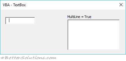
A multiline text box will not show a scroll bar unless the control has the focus
The mouse scroll wheel cannot be used in a textbox control
| AutoSize | Specifies whether an object automatically resizes to display its entire contents. |
| AutoTab | Specifies whether an automatic tab occurs when a user enters the maximum allowable number of characters into the control |
| AutoWordSelect | Specifies whether a word or a character is the basic unit used to extend a selection. |
| BackColor | Specifies the background color of the object. |
| BackStyle | Returns or sets the background style for an object. |
| BorderColor | Specifies the color of an object's border. |
| BorderStyle | Specifies the type of border used by a control or a form. |
| CanPaste | Specifies whether the Clipboard contains data that the object supports. |
| CurLine | Specifies the current line of a control. (Control must have the focus) |
| CurTargetX | (Rea Only) Retrieves the preferred position, measured in himetric units. A himetric is 0.0001 meter. |
| CurX | Specifies the current horizontal position of the insertion point in a multiline control. (Control must have the focus) |
| DragBehaviour | Specifies whether the system enables the drag-and-drop feature for a control. |
| Enabled | Specifies whether a control can receive the focus and respond to user-generated events. |
| EnterFieldBehaviour | Specifies the selection behavior when entering a control. |
| EnterKeyBehaviour | Defines the effect of pressing ENTER in a control. |
| Font | Defines the font name, size and style of the displayed text. |
| ForeColor | Specifies the foreground color of an object. |
| Height | Gets or sets the height of the specified object in twips. |
| HideSelection | Specifies whether selected text remains highlighted when a control does not have the focus. |
| IMEMode | Specifies the default run time mode of the Input Method Editor (IME) for a control. |
| IntegralHeight | Indicates whether a control displays full lines of text in a list or partial lines. |
| Left | Specifies the distance of the object from the left of the parent control in twips. |
| LineCount | (Read Only) Returns the number of text lines in a control. (Not displayed in Properties window) |
| Locked | Specifies whether a control can be edited. |
| MaxLength | Specifies the maximum number of characters a user can enter in a control. |
| MouseIcon | Assigns a custom icon to an object. |
| MousePointer | Specifies the type of pointer displayed when the user positions the mouse over a particular object. |
| MultiLine | Specifies whether a control can accept and display multiple lines of text. |
| PasswordChar | Specifies whether placeholder characters are displayed instead of the characters actually entered in a textbox. |
| ScrollBars | Specifies whether a control, form, or page has vertical scroll bars, horizontal scroll bars, or both. |
| SelectionMargin | Specifies whether the user can select a line of text by clicking in the region to the left of the text. |
| SelLength | The number of characters selected in a control. |
| SelStart | Indicates the starting point of selected text, or the insertion point if no text is selected. |
| SelText | Returns or sets the selected text of a control. |
| SpecialEffect | Specifies the visual appearance of an object. |
| TabKeyBehaviour | Determines whether tabs are allowed in the edit region. |
| Text | Returns or sets the text in a TextBox. |
| TextAlign | Specifies how text is aligned in a control. |
| TextLength | (Read Only) Returns the length, in characters, of text in the edit region of a control. |
| Top | Specifies the distance of the object from the top of the parent control in twips. |
| Value | Specifies the state or content of a given control. |
| Width | Gets or sets the width of the specified object in twips. |
| WordWrap | Indicates whether the contents of a control automatically wrap at the end of a line. |
| BeforeDragOver | Occurs when a drag-and-drop operation is in progress. |
| BeforeDropOrPaste | Occurs when the user is about to drop or paste data onto an object. |
| Change | Occurs when the Value property changes. |
| DblClick | Occurs when the user points to an object and then clicks a mouse button twice. |
| DropButtonClick | Occurs whenever the drop-down list appears or disappears. |
| Error | Occurs when a control detects an error and cannot return the error information to a calling program. |
| KeyDown | Occurs when the user presses a key on a running form while that form or a control on it has the focus. |
| KeyPress | Occurs when the user presses an ANSI key. |
| KeyUp | Occurs when the user releases a key on a running form while that form or a control on it has the focus. |
| MouseDown | Occurs when the user presses the mouse button. |
| MouseMove | Occurs when the user moves the mouse. |
| MouseUp | Occurs when the user releases the mouse button. |