OptionButton (opt)
 | OptionButton - This control allows the user to select from a list of possible choices. These controls are usually placed within a Frame. |
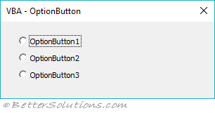
These should be used when you want the user to pick from a small number of mutually exclusive choices
These are always used in groups of at least two as when one is selected the others are unselected automatically.
If you dialog box contains more than one set of Option Buttons then each set must have the same GroupName otherwise they all become part of the same set
Alternatively you can place your option buttons in a Frame that automatically groups them.
Properties
| Accelerator | Sets or retrieves the accelerator key for a control. |
| Alignment | Specifies the position of a control relative to its caption. |
| AutoSize | Specifies whether an object automatically resizes to display its entire contents. |
| BackColor | Specifies the background color of the object. |
| BackStyle | Returns or sets the background style for an object. |
| Caption | Descriptive text that appears on an object to identify or describe it. |
| Enabled | Specifies whether a control can receive the focus and respond to user-generated events. |
| Font | Specifies the font used to display the caption text. Tahoma, regular, 8 (default) |
| ForeColor | Specifies the foreground color of an object. |
| GroupName | Creates a group of mutually exclusive OptionButton controls. |
| Locked | Specifies whether a control can be edited. |
| MouseIcon | Assigns a custom icon to an object. |
| MousePointer | Specifies the type of pointer displayed when the user positions the mouse over a particular object. |
| Picture | Specifies the bitmap to display on an object. |
| PicturePosition | Specifies the location of the picture relative to its caption. |
| SpecialEffect | Specifies the visual appearance of an object. |
| TextAlign | Specifies how text is aligned in a control. |
| TripleState | Determines whether a user can specify, from the user interface, the Null state for a CheckBox or ToggleButton. |
| Value | Specifies the state or content of a given control. |
| WordWrap | Indicates whether the contents of a control automatically wrap at the end of a line. |
Events
| BeforeDragOver | Occurs when a drag-and-drop operation is in progress. |
| BeforeDropOrPaste | Occurs when the user is about to drop or paste data onto an object. |
| Change | Occurs when the Value property changes. |
| Click | Occurs when the user clicks on the control. |
| DblClick | Occurs when the user points to an object and then clicks a mouse button twice. |
| Error | Occurs when a control detects an error and cannot return the error information to a calling program. |
| KeyDown | Occurs when the user presses a key on a running form while that form or a control on it has the focus. |
| KeyPress | Occurs when the user presses an ANSI key. |
| KeyUp | Occurs when the user releases a key on a running form while that form or a control on it has the focus. |
| MouseDown | Occurs when the user presses the mouse button. |
| MouseMove | Occurs when the user moves the mouse. |
| MouseUp | Occurs when the user releases the mouse button. |
© 2026 Better Solutions Limited. All Rights Reserved. © 2026 Better Solutions Limited TopPrevNext